
Golden Harvest Chinese Restaurant

Project Details
Client
Personal Project
Timeline
50 Hours
Role
UX Researcher
Product Designer
Graphic Designer
Project Type
Responsive Design
The Process
1.Empathize
Conducting research and understanding the users through interviews
2.Define
Identifying pain points from user feedback
3.Ideate
Brainstorming and building
4.Design
Creating wireframes based on research and deliverables
5.Test
Prototyping and usability testing
6.Wrap Up
Key findings and reflections to move forward
Empathize
Understanding and Relating
The Problem
Golden Harvest is a family owned Chinese Restaurant in Sioux Falls, South Dakota. It’s been around for over 20 years and has become an institution in the city. The owners of Golden Harvest are not tech savvy and have done the bare minimum for their site. The menu still confuses customers as they constantly call the restaurant with many questions regarding the menu.


The Solution
Through competitive analysis, user interviews, and research, my objective was to modernize the Golden Harvest website while staying true to the restaurant's authentic ethos. By giving the site a modern facelift, I aimed to create a visually appealing platform that reflects the dedication and hard work invested in this family-owned establishment.
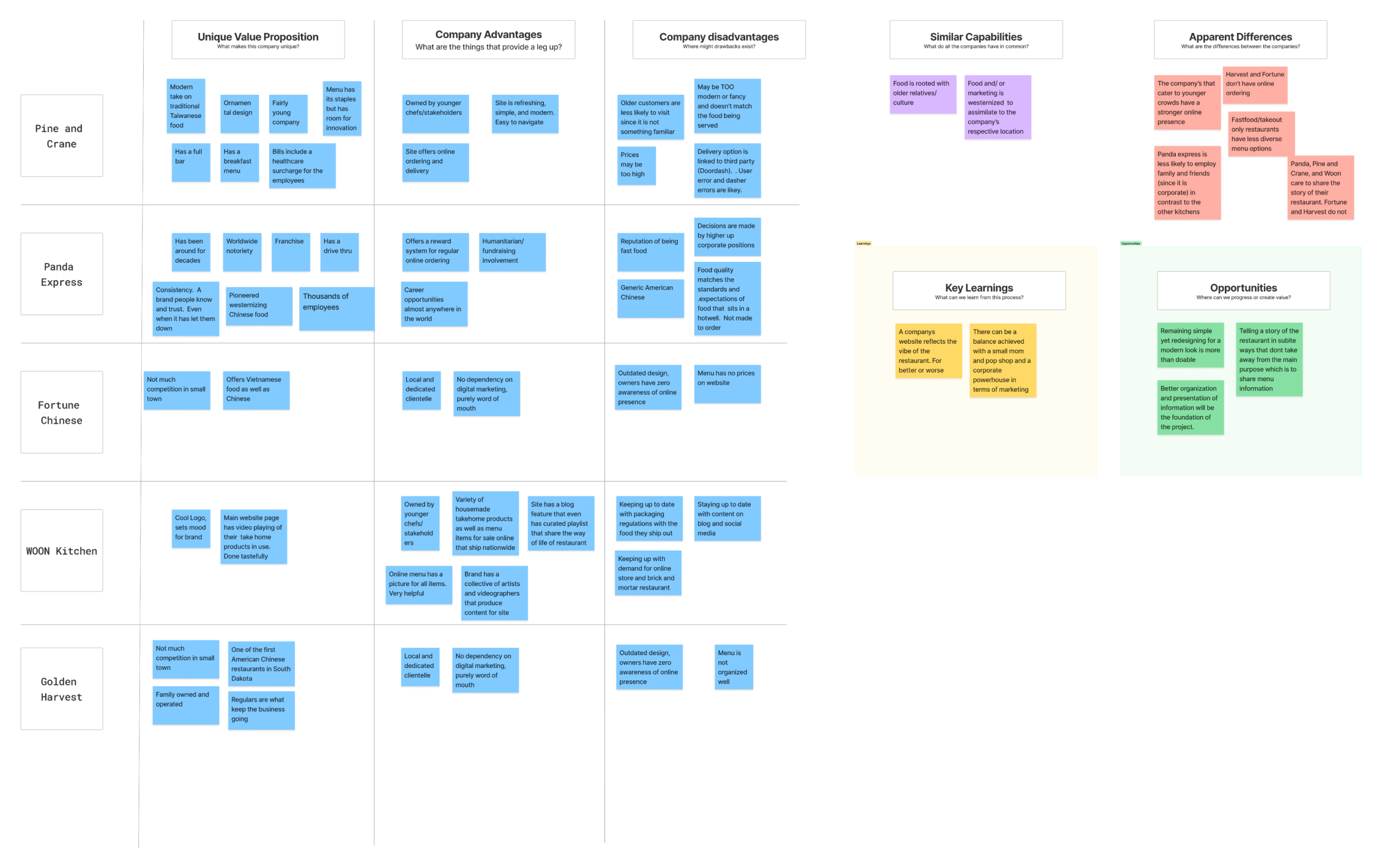
To understand the core problems and the needs of our target audience, I conducted a mix of qualitative and quantitative research, including user interviews, surveys, and competitive analysis based on the current website of Golden Harvest
User Feedback
-More pictures would be helpful
-Having a CTA such as specials or combo meals would be useful
Consolidating information would save space and make the site more modern
-Font choices are inconsistent
-Overall look of the site feels dated and quickly put together
-Putting contact info, address, and hours in a more stand out spot would be useful for diners
-Having as much information laid out on the main page might save time and be more convenient
-Pictures of the food or inside of the restaurant would be helpful and would add character to an older establishment such as this
-Links to yelp or google reviews since the reviews of this restaurant are really good.
Define
Research and Feedback
The user interviews provided valuable feedback on what users thought of the existing website and what they would enjoy from a newly designed version. I created an affinity map to better organize my findings and to highlight general insights and patterns. This deliverable helped to provide me a clearer understanding of user behaviors, needs, and motivations.

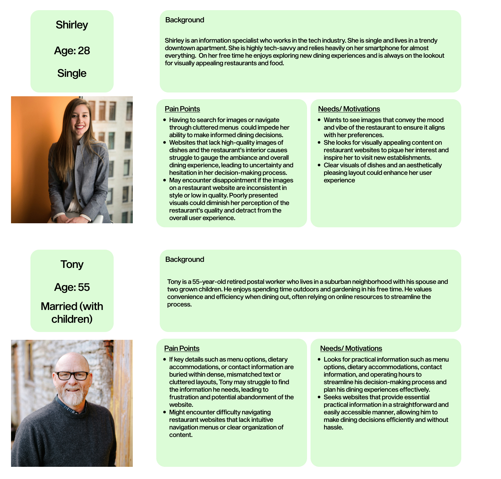
Now that I knew what needs and pain points to prioritize from the user interviews and affinity map, I defined 2 core personas to represent users who would benefit from the redesign. By understanding the distinct motivations, challenges, and needs, I would be able to tailor the design to address specific user experiences moving forward. This approach ensured that the platform is not only user-friendly but also resonated with a broad audience.
Ideate
Synthesize Research Findings and Creating Building Blocks
Given the personas, I had a better understanding of user behavior. Using that knowledge, I created task flows to serve as essential guides for the design and development phases of the website. They not only outlined the logical paths users would follow but also provided insights into potential areas for improvement.

Design
Framework and Branding
Now that the essential features of the website were more concrete based on the research, it was time to sketch out the newly designed website. For the low fidelity wireframes, I based the design off the simple features of the website. After I laid out the framework, I was able to incorporate branding and visual design for the higher fidelity wireframes.
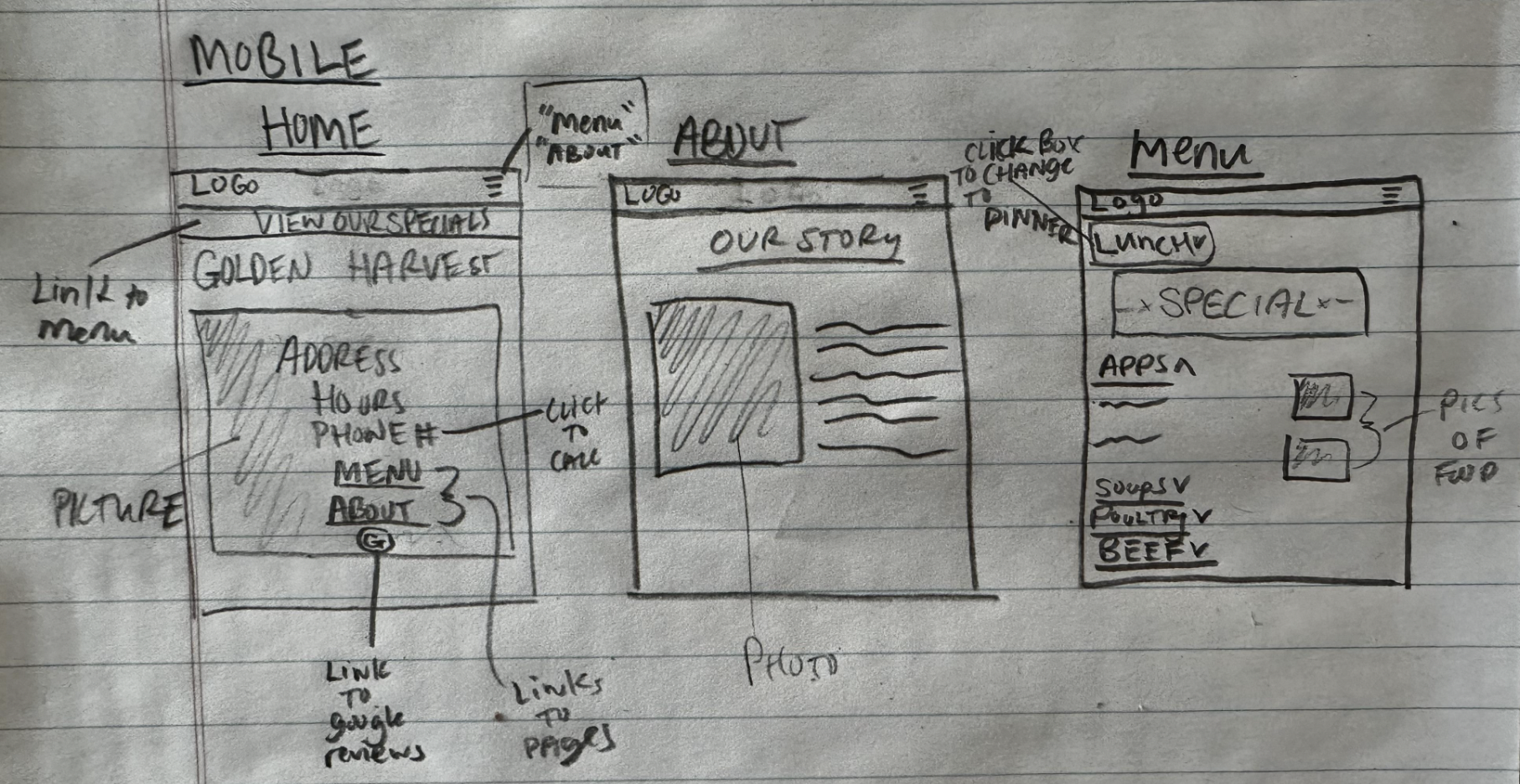
For branding,I aimed to reflect the essence of the establishment, combining traditional elements with a modern twist. The selected colors, typography, and overall design aim to create an inviting and memorable experience for diners.


Test
Gauging Efficiency, Accessibility, and Effectiveness
After conducting usability tests, here’s what I gathered:
-Users found it convenient to have all the restaurant info (address, hours, and contact info) in one are of the design. It was very easy to find.
-Simple and attractive.
-Not challenging to use.
-Looks modern without being contrived.
-Theres consistency throughout the site and its predictable in a good way.
-The colors set the mood for the entire aesthetic and were inviting and warm. They matched the interface beautifully.
-The pictures were a good fit for the website and enticed users to want to visit and try the food out.
I kept the wireframes as-is since the feedback I received through usability testing did not warrant any change.
Conclusion
Final Thoughts
Upon deciding the redesign was for my family's restaurant, I envisioned its direction. Throughout the capstone, I learned the importance of accepting and seeking critique from my mentor and peers, which significantly aided the process. I also recognized the value of flexibility and managing expectations when designing for others.