

Mood Based Content Feature On Netflix (Mobile)
Project Details
Client
Personal Project
Timeline
60 Hours
Role
UX Researcher
Product Designer
Graphic Designer
Project Type
Adding A Feature
The Process
1.Empathize
Conducting research and understanding the users through interviews
2.Define
Identifying pain points from user feedback
3.Ideate
Brainstorming and building
4.Design
Creating wireframes based on research and deliverables
5.Test
Prototyping and usability testing
6.Wrap Up
Key findings and reflections to move forward
Empathize
Understanding and Relating
The Solution
By allowing users to select a mood, the platform curates a tailored list of TV shows and movies that align with their feelings. The "Mood-Based Content Suggestions" feature would allows users to select their current mood and receive content that aligns with it, offering a more personalized and satisfying viewing experience. This approach goes beyond traditional recommendation algorithms based on past behavior, delivering a more personalized and emotionally connected viewing experience. This simplifies decision-making and increases user satisfaction.
The Problem
In today’s streaming world, users often struggle with choosing what to watch due to the overwhelming number of options. Traditional recommendation systems focus on viewing history and genre preferences, which don’t always match how a user feels at the moment.

To understand the core problems and the needs of our target audience, I conducted a mix of qualitative and quantitative research, including user interviews, surveys, and competitive analysis.
User Feedback
-Users across the board value personalized content that accurately reflects their preferences and moods. However, many feel that current algorithms are either too broad or push trendy content that doesn't always match their mood or interests.
-Users frequently feel overwhelmed by the sheer volume of content, leading to decision fatigue or reverting to familiar content
-Mood plays a significant role in content selection for most users
-Users feel they would benefit from improved visual and interactive elements that make it easier to select content based on mood. Users expressed that it could save time, reduce overwhelm, and better align content with their current emotional state.
-Users desire more control over their content recommendations.
Define
Research and Feedback
Based on empathy and understanding in the affinity map, I created two core personas to represent users benefiting from the mood-based feature. This deliverable was a crucial reference to validate my design choices in the later steps

To better organize user feedback , I made an affinity map to categorize my findings from the interviews. Being able to take a step back and view trends and correlations helped me address user specific issues and establish goals for the project,

Ideate
Synthesize Research Findings and Creating Building Blocks
Based on my personas, I recognized that users often felt overwhelmed by the sheer volume of content and wanted a more intuitive, mood-driven way to browse. I synthesized the research into a feature roadmap based on users preferring a quick, simple navigation with clear categories to refine their choices.

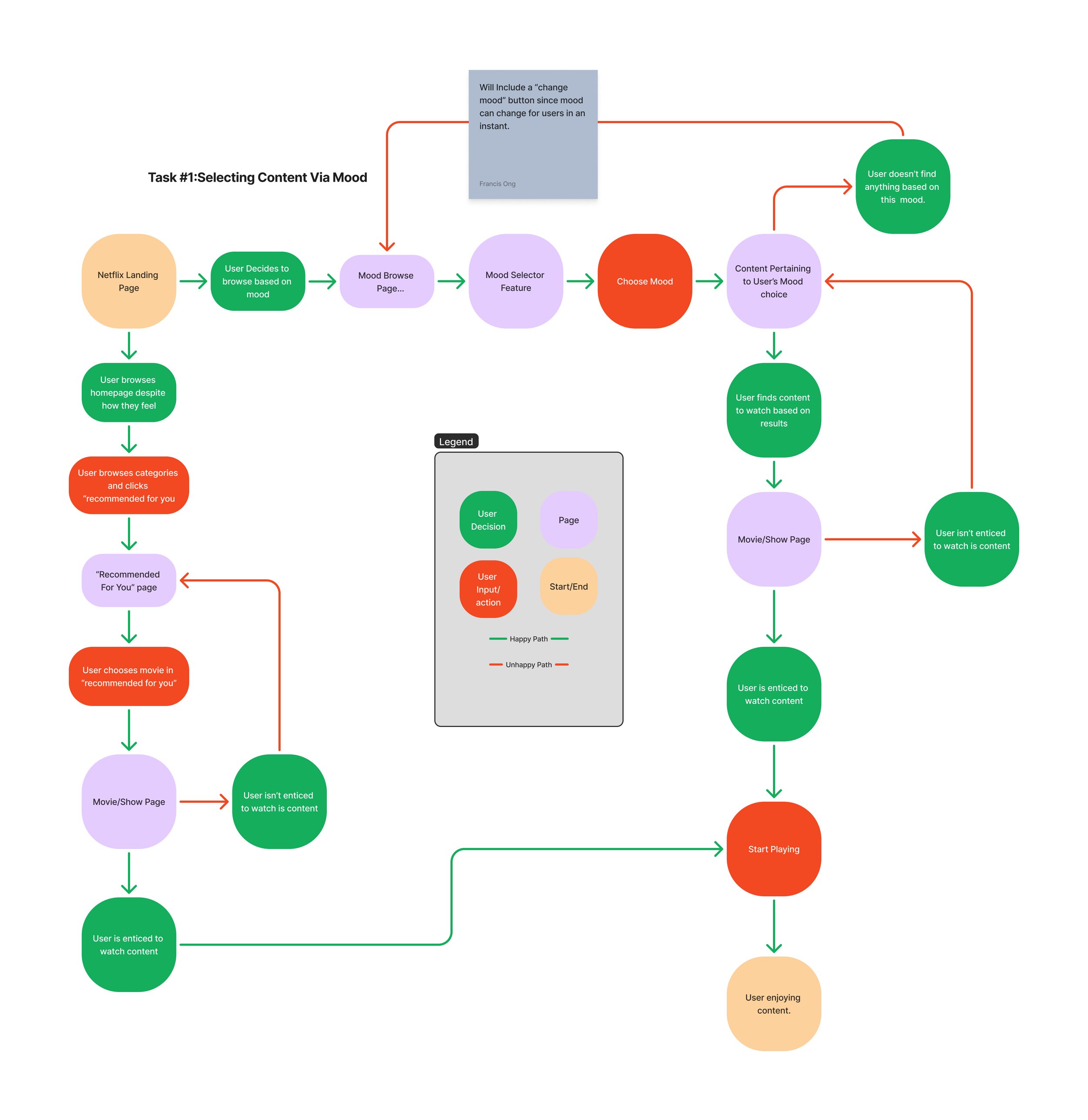
To address the users’ needs in the most intuitive and streamlined way, I designed the sitemap to integrate a dedicated "Mood" selection feature directly within the Netflix home page navigation. This decision was made to provide immediate access to the mood-based recommendations feature.

The user flows for the "Mood-Based Content Suggestions" feature were designed with direct reference to the insights gathered from my user research and interviews. My research revealed that users often struggle with decision fatigue when browsing through the vast amount of content, and they desire a more personalized approach that aligns with their current emotional state. Moving forward, I aimed to reduce friction in the user journey. With the goal in mind, building wireframes based on user actions became clearer to me.
Design
Framework and Branding
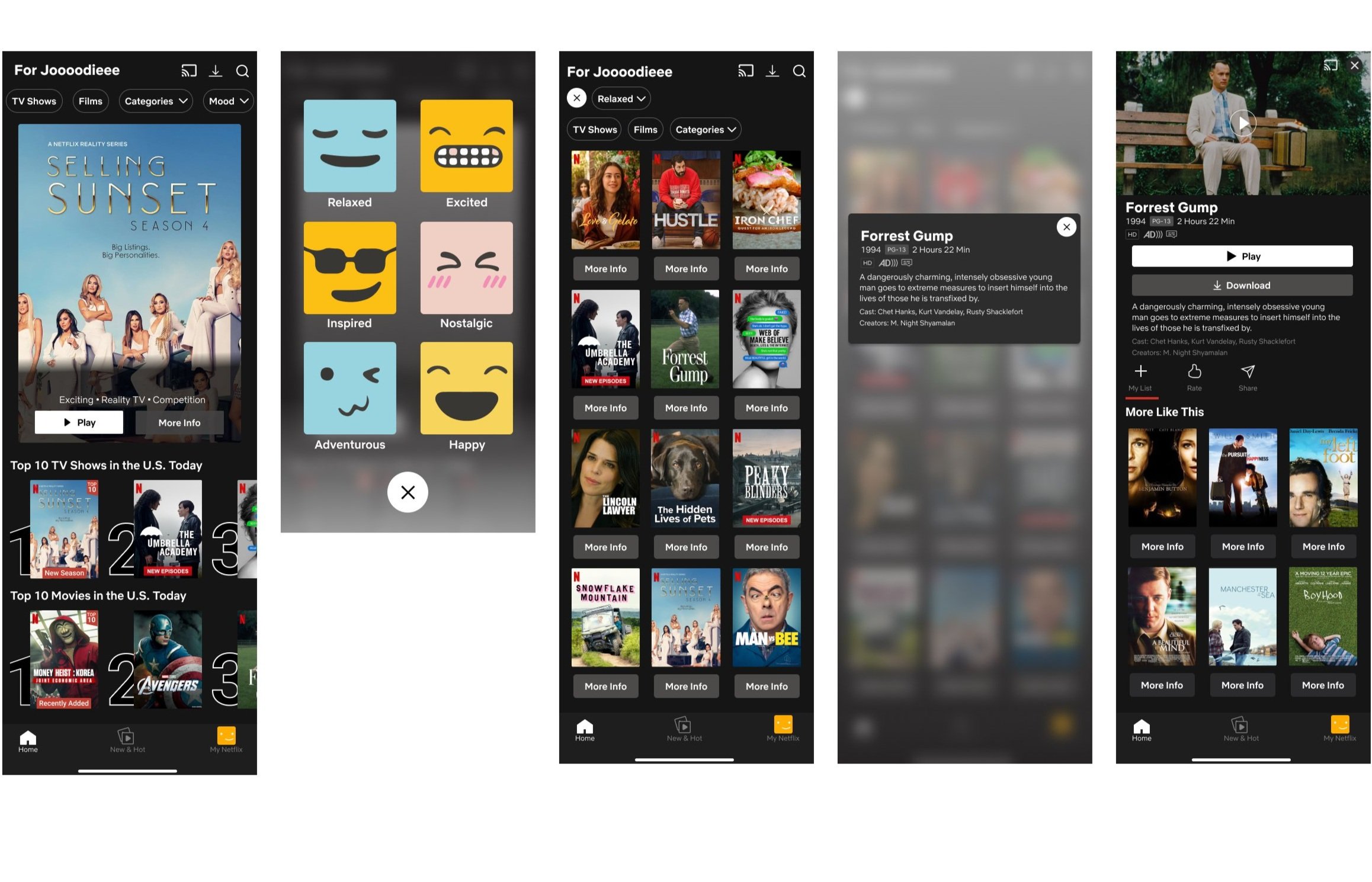
Now that the new feature was more mapped out, it was time to form the interface. When sketching the low-fidelity wireframes I focused on the overall structure and user flow while keeping the integrity of the original Netflix layout. After further iterations, high-fidelity wireframes were formed to incorporate visual design elements and finer details. User testing and interviews heavily influenced this process, allowing me to make informed adjustments at each stage.


Test
Gauging Efficiency, Accessibility, and Effectiveness
Now that the digital wireframes were laid out to the highest fidelity, I made clickable prototypes for usability testing.
Here’s what the users had to say during testing:
- “The mood selector was easy to find. The icons were fun to use and very welcoming. It felt like a nice personal touch to the app.”
- “Excited to see how more ‘moods’ can be implemented like ‘adventurous’ or ‘happy’.”
- “I like having the ‘TV’ or ‘movie’ filter right on top of the results page. That alone is enough to help me narrow down my choices.”
- “The design is nice. It felt familiar to the original Netflix layout”
- “ I like the ‘more info’ buttons in the results page. Sometimes I don’t want to be directed to a whole new page so having little bits of info accessible is helpful.”
- “The emojis in the mood selector were so cute and caught my attention right away.”
- “Would use this feature if I wasn’t sure of what to watch.”
Given the user feedback, I added more options on the mood selector.
Conclusion
Final Thoughts
This project challenged me to think creatively while enhancing an established product like Netflix. I felt pressure to design within the existing interface, but with my mentor's guidance, I honed my attention to detail. The research phase was enjoyable as I connected with users to understand their behaviors and frustrations, notably the common issue of decision fatigue. This insight highlighted that the new feature could address a prevalent problem. A key takeaway for me was the importance of balancing simplicity with innovation; new features should be intuitive and seamlessly integrated for users within an existing product.